Loading...
00

%


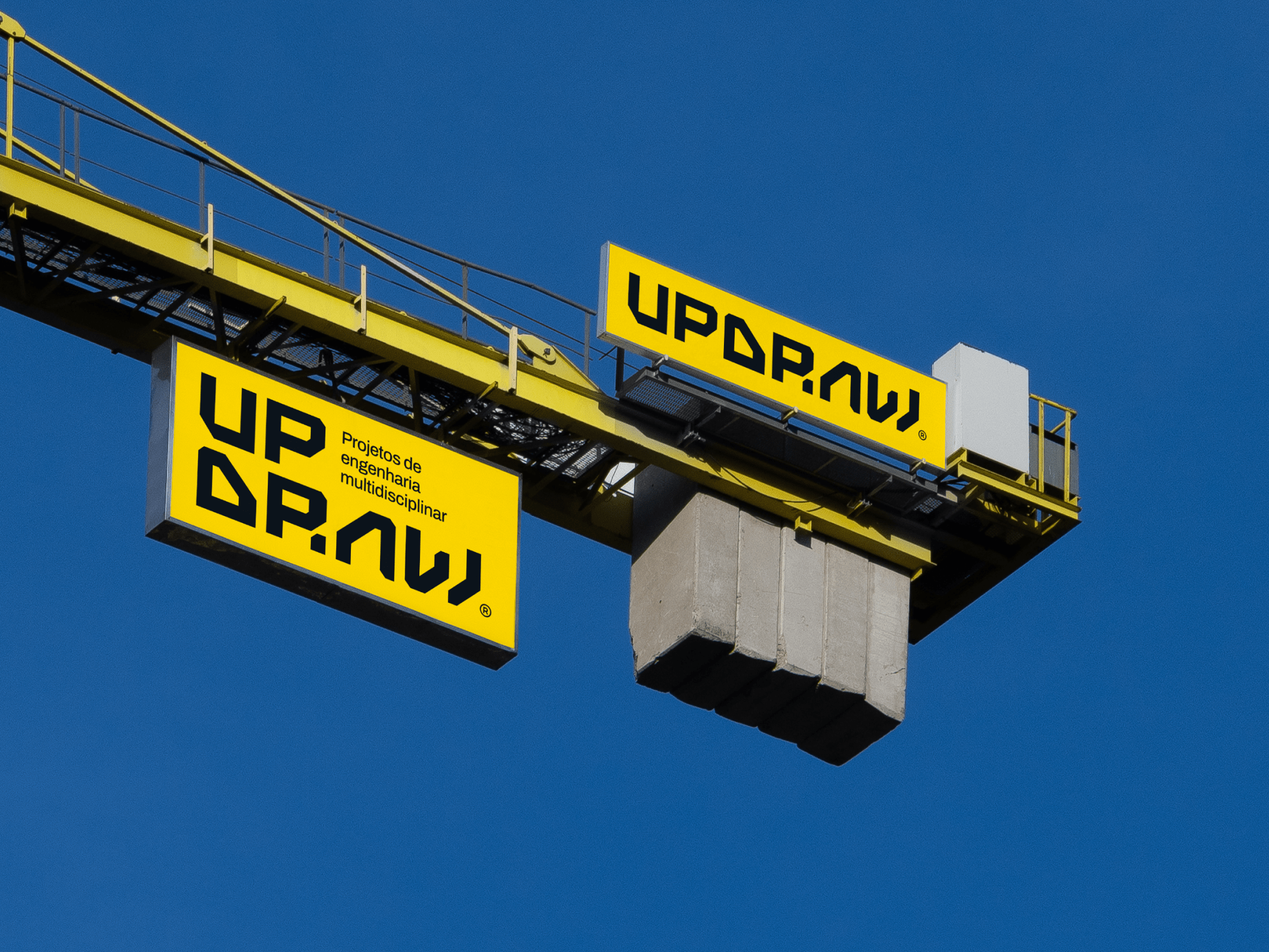
Engineering needs more than precision. It needs presence.
UPDRAW was already known for its technical expertise — but lacked a brand that communicated its real weight in the industrial world.
We built a visual identity that matched the company’s intelligence, trust and operational power.
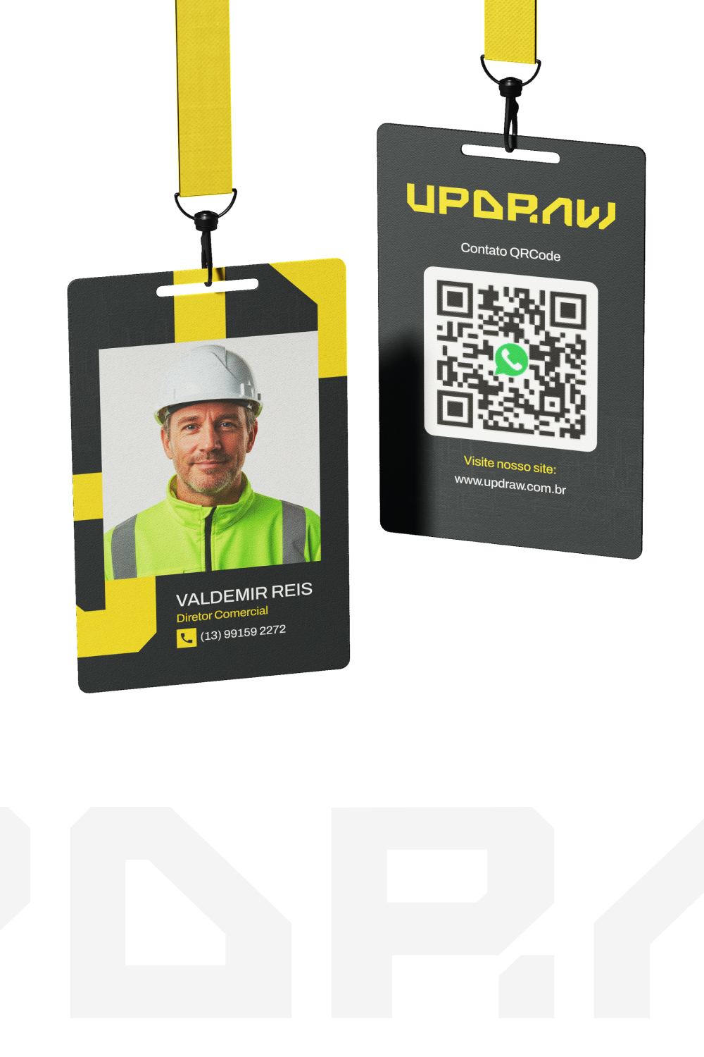
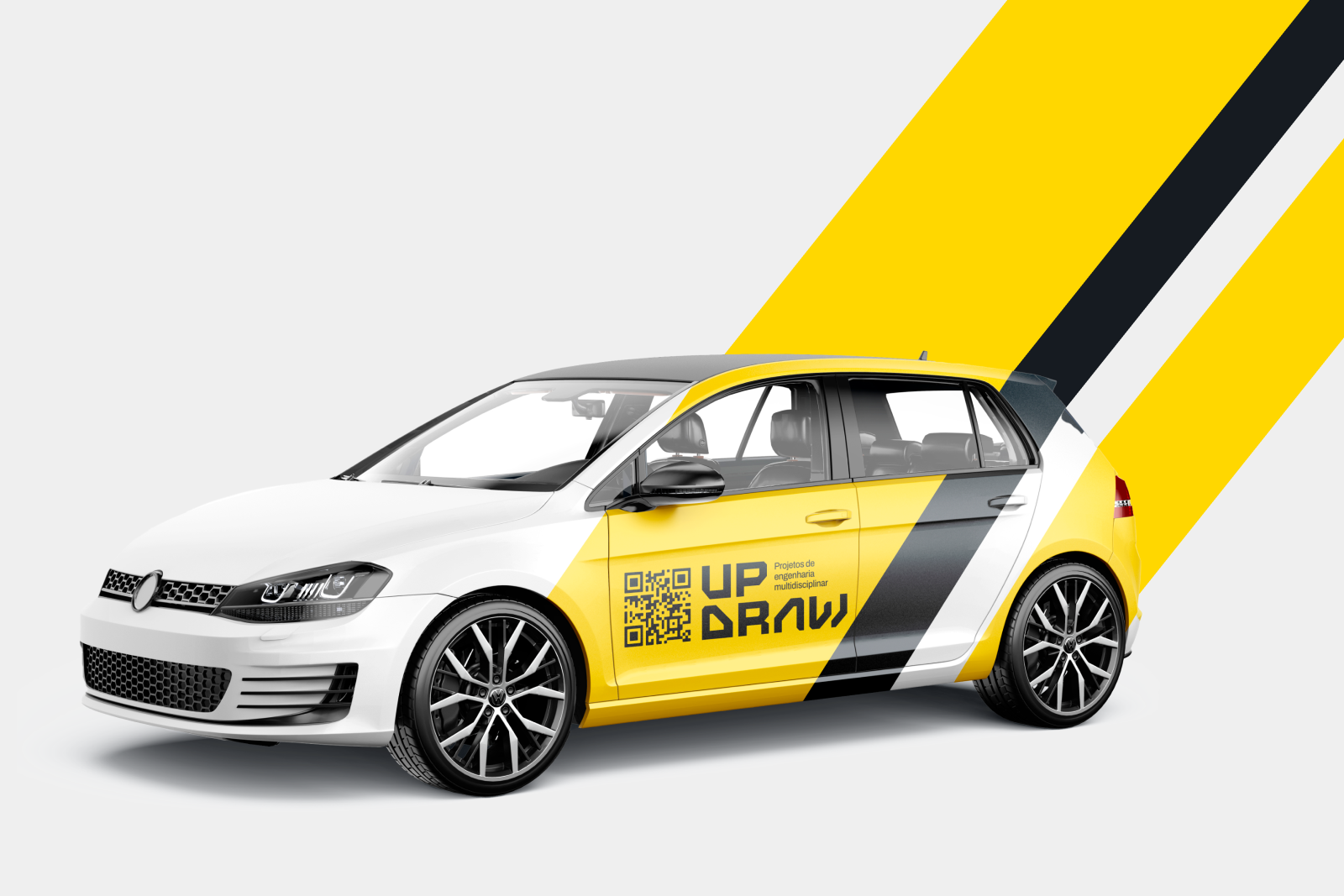
From logo to paper systems, we gave structure to how the brand appears, moves and speaks.

The rebrand used clean lines, strong contrast and structured typography.
Archivo was chosen for its clarity and discipline.
The Gold + Bunker palette brings together innovation and solidity.
Every layout, margin and visual cue was designed for usability — whether in industrial signage or digital dashboards.
UPDRAW now communicates as clearly as it operates.
A consistent system across every touchpoint has elevated how the brand is perceived — by partners, industries and decision-makers.