Loading...
00

%


Johnny Souza is a global reference in Jiu-Jitsu, known for his discipline, technique and transformational approach.
The mission was clear: create an identity that reflects his story, his seriousness, and the vision behind his BJJ Club.
A brand with soul, purpose and strength — just like the master himself.
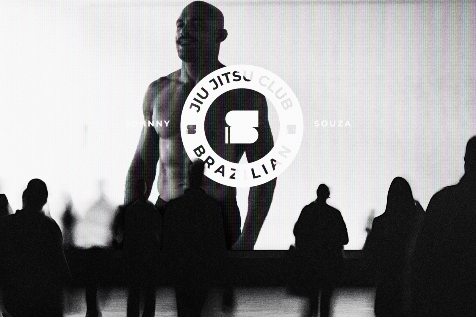
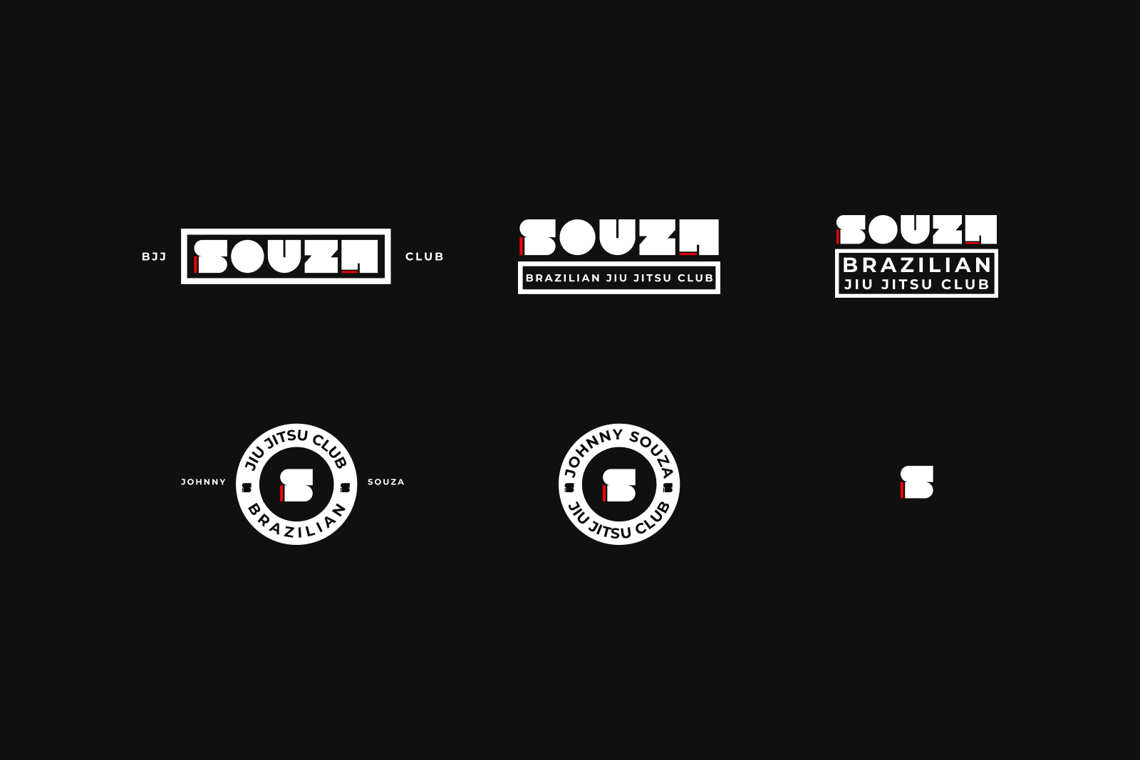
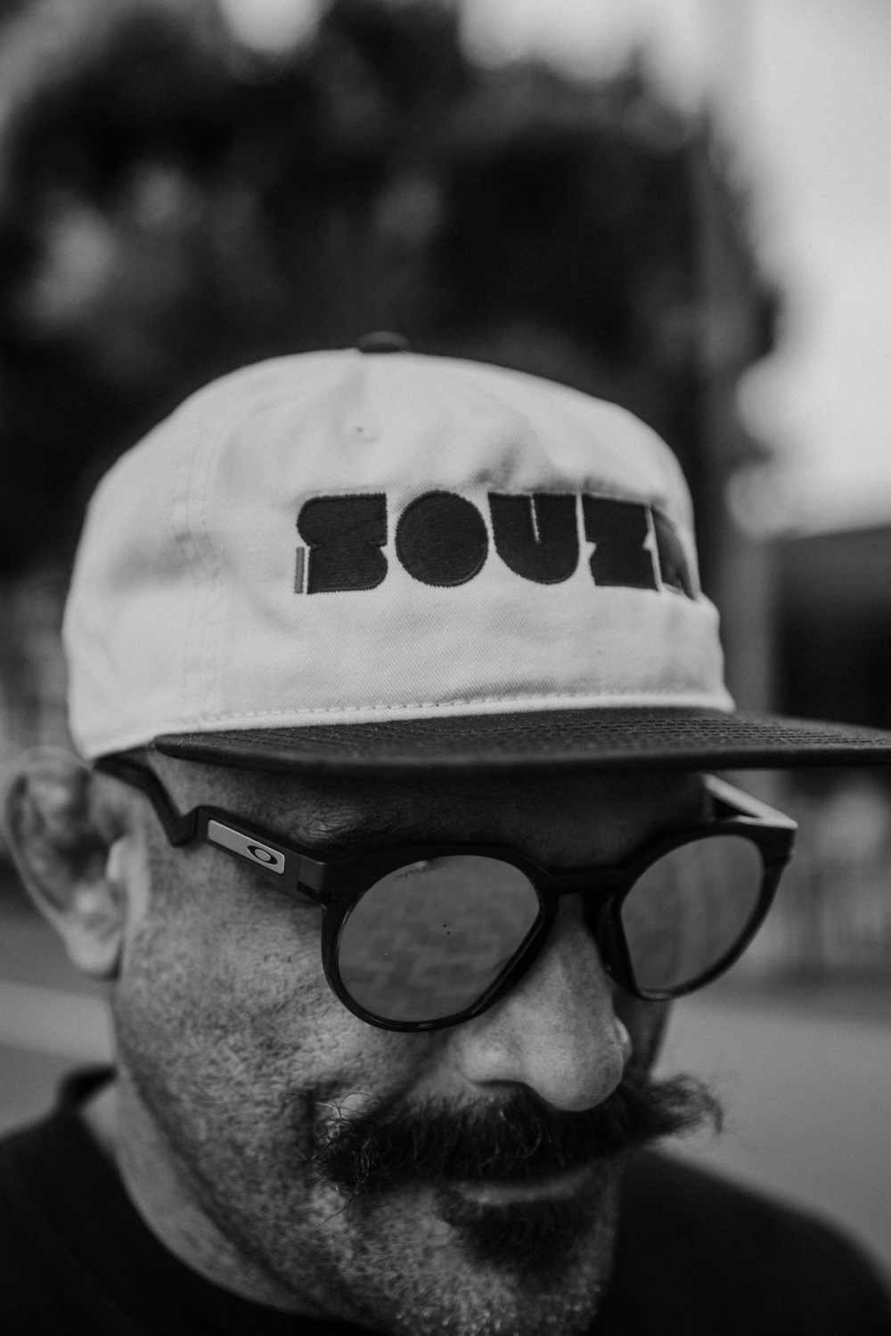
The project is grounded in strong, sharp-edged typography with real character.
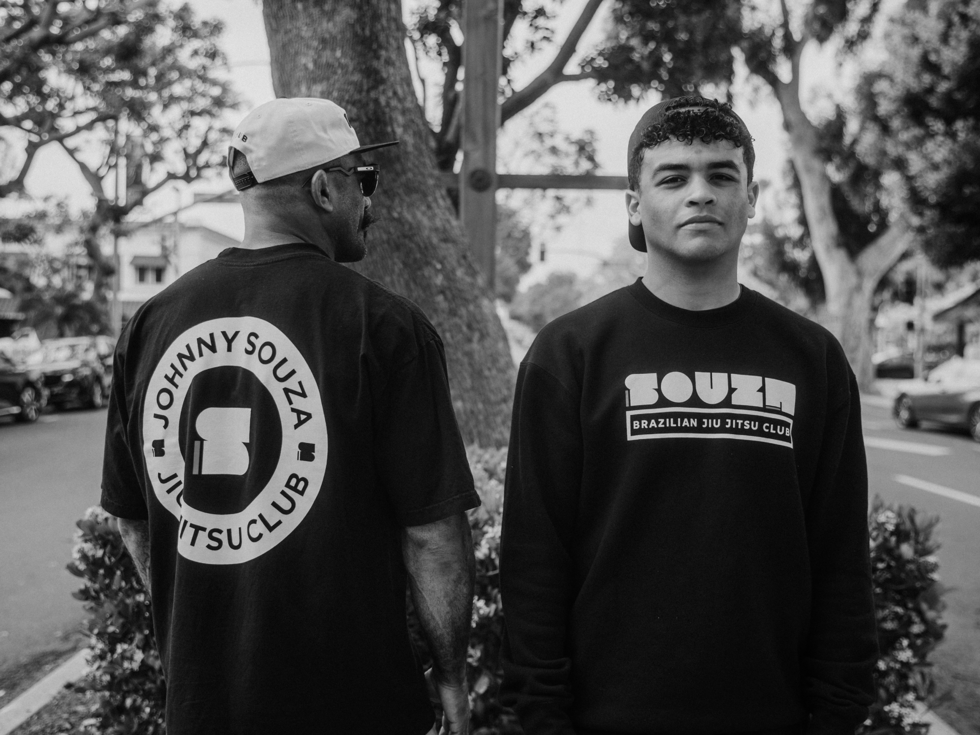
The color palette — black, white and red — expresses energy, confidence and professionalism.
The logo is modular and bold, working across surfaces, uniforms and social content.
Every detail honors what matters: humanity, discipline, technique and inspiration.