Loading...
00

%


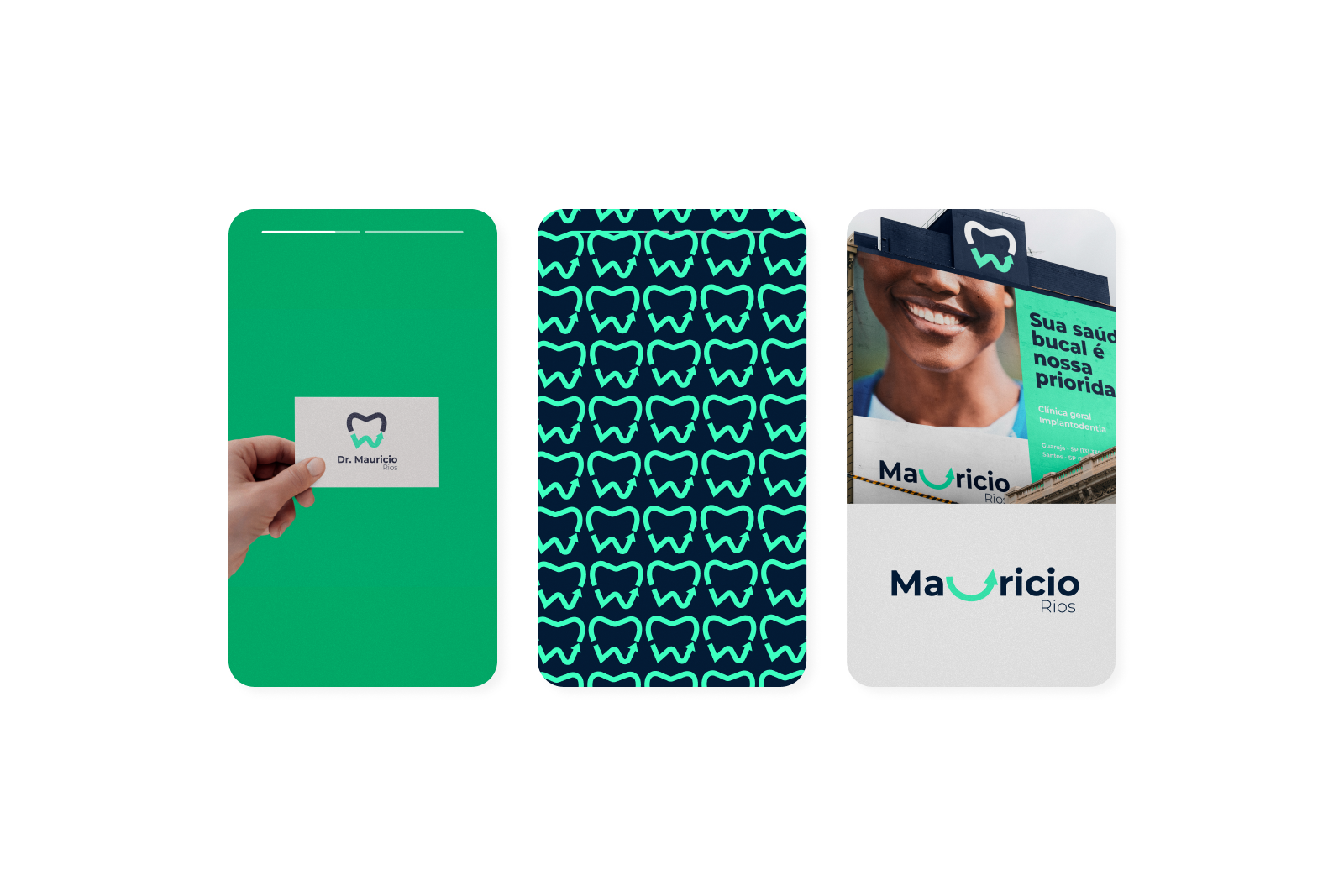
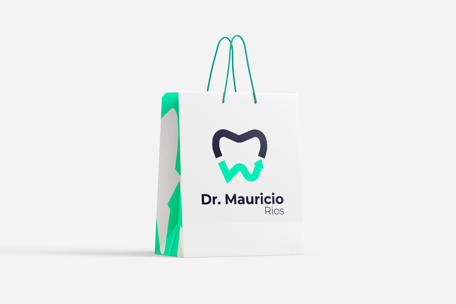
With over two decades of experience, Dr. Maurício Rios had built a reputation — but not a brand that reflected it.
We created a visual identity that speaks clearly, reflects precision, and most of all, radiates humanity.
Because no one delivers a safe smile without becoming a reference for it.

We crafted a visual system that projects authority without coldness, and lightness without fragility.
The blue palette — clean, clinical, deliberate. The typography — sharp, elegant.
The symbol? A visual signature for someone who treats with discipline — and care.
It’s the aesthetics of someone who knows a smile isn’t just seen — it’s felt.